Remember Clippy? He lives on—sort of. Here's what Clippy taught us about annoying software, bad UX, and how we're building upon his legacy.
Interacting with technology has become second nature for most of us. Conversing with Alexa about the weather in 2022 is what we used to see on TV in the 90s and think “damn, that’s futuristic.” Although we haven’t seen any flying cars, technology has dramatically transformed, alongside the ways we interact with it.
The origins of Clippy (and other anthropomorphic assistants)
If you were lucky enough to witness the fascinating beginnings of personal computer adoption in consumer homes, roughly between 1995 and 2000, chances are the sight of a googly-eyed paper clip will bring up some memories. Mostly frustrating ones.
Clippit, commonly nicknamed Clippy, was one of the most hated user interface components in computer history. To understand why Microsoft built and maintained the despised sidekick for roughly a decade, we need to understand what software usability was like in the late 90s and Microsoft’s attempt to improve it.
The lack of GUIs in the early days of operating systems meant users had to interact with apps through command-line style interfaces (ICYMI, that’s where dark mode originates from). This obviously wasn’t easy for those who were new to this kind of technology. Microsoft needed to make it easier for people to communicate with the new additions to their homes: PCs that were running Windows. The first attempt at this was Bob, an alternative to the Desktop interface. Instead of icons and menu bars, you’d be presented with virtual rooms that were part of a larger house. No more long, complex help manuals.
You’d start by taking a tour of the house with the front door acting as your sign-in. Once you were in, you’d move on to the rooms, where items were shortcuts to Windows applications. For instance, if you wanted to open Microsoft Word, you’d have to click on the pen and paper. How would you know to do that? Well, with the help of a few anthropomorphic assistants that would sit in the corner and guide you through the house. One of them was Clippy.

The idea behind Bob was inspired by an unfortunate misinterpretation of the social research by two Stanford professors, Clifford Nass and Byron Reeves. They proved that humans react to computers with the same set of emotional reactions they use to react to other humans. Alan Cooper (a.k.a. the "Father of Visual Basic") argued that Microsoft’s mistake was introducing characters like Clippy: “if people react to computers as though they're people, we have to put the faces of people on computers [...] the one thing you don't have to do is anthropomorphize them because they're already using that part of the brain.“
The reaction to Bob was strongly negative, eventually leading to its demise in 1996. But two offspring managed to survive. The first one is Bob’s son, Clippy (and the entire family of anthropomorphic assistants). The second still lives on today, mainly through memes and ongoing jokes -- Comic Sans, a font that was created exclusively for Microsoft Bob.
What was Clippy trying to do?
Clippy worked by popping up in the corner each time you’d open Microsoft Office. It would usually offer to help you with things like writing a letter, spelling, or saving files. “It looks like you’re writing a letter. Would you like help?” said one prompt that’s still deeply ingrained in the memory of those who knew Clippy.
Conceptually, Clippy was a great idea, especially for those opening a word processing app for the first time. Getting an introduction to a piece of software you’re not familiar with seems like a great way to flatten the learning curve. Nudging users down happy paths is something developers and designers still aim for when building great UX.
That’s what Clippy was supposed to be, a guru ready to answer your questions and guide you through the confusion.
Where did Clippy go wrong?
You could also think of Clippy as the friend who sits next to you and walks you through concepts you struggle to grasp. Except it wasn’t very friendly. Clippy didn’t know who you were, what your name was, or what goals you were trying to achieve.
A lack of personalization
Clippy couldn’t be more different than today’s software when it comes to personalization. Although advanced for its time, the functionality of the Microsoft Office assistant was lacking, and its memory was poor. Regardless of how often you’d dismiss its advice, it would still pop-up thinking you were in dire need of help. As Microsoft employee and journalist James Fallows put it, “The next billion times you typed ‘Dear …’ and saw Clippy pop up, you wanted to scream.”
The state of AI in the late 90s was nowhere near what we see today. The idea of recommender systems was just blossoming, and their purchase recommendations were mostly based on random opinions. Clippy told you what to do. That’s it. It never listened.
Too invasive
More than personalization, what drove many people away from Clippy was its invasiveness. One of Clippy’s signature features was knocking on your screen if you were idle at your computer. This didn’t really serve any purpose apart from interrupting your real life.
Infantilizing the user
At some point, a routine computer user would master the basic features. Clippy’s cartoonish appearance, its naggy nature, and constant need for attention would become annoying. Advanced users didn’t need a paperclip to tell them what to do, yet there he was.
What Clippy got right
Despite all the critique, Clippy was ahead of its time. It was Microsoft’s version of an MVP that was trying to incorporate AI into mainstream products aimed at the average user.
Even though unsuccessful, Clippy laid the groundwork for a problem we’re still seeing companies grappling with today: software can be hard to use. It forced engineering and product teams to be user obsessed and made space for things like intent classification to be embedded in the experience.
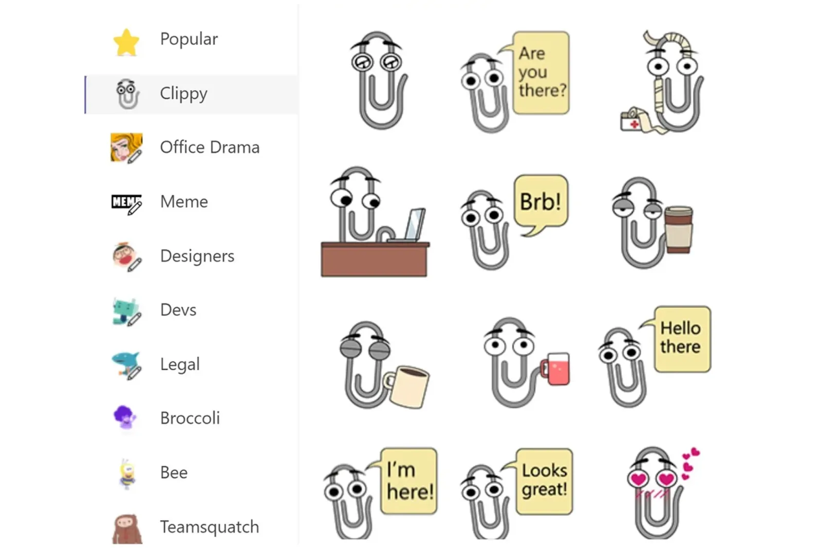
Clippy’s legacy lives on
With each iteration of new technology since Clippy, it has only gotten more complex. The problem of apps being hard to use has never gone away. That’s led to a Cambrian explosion of in-app tools, designed to help with product adoption, feature adoption, and reduce user friction. So much so that we’ve seen new categories of products emerge to help solve it.
Help desk widgets
Help desks are a place for users to find information and get their product-related issues solved. They take your entire knowledge base and documentation and embed it in your product. You’d most commonly find this under a “Help” section or a “Docs” one for more technical products.
Some of the more popular choices include Zendesk and Freshdesk. They’re non-invasive and, depending on the type of content, can be helpful to both new and power users, although they are mostly targeted at those just getting familiar with the product. Often we’ll see help desks link to a live chat option in the case that the customer isn’t able to find a solution through the help articles.
Chatbots
Depending on your product, these can either use AI to filter through commonly asked questions or connect the customer with a live support agent. Closely related to how Clippy used to operate, we frequently see chatbots pop up at the beginning of a browsing session, prompting the user to explore different website sections. This leaves the level of invasiveness up to the team implementing it.
Both new and power users can benefit from these as they don’t limit the type of questions that can be answered, as opposed to a help desk widget, with Intercom being the most widely-used example.
Tooltips
Tooltips are explanations displayed when hovering over a website element. These act as just-in-time support, helping users navigate unknown objects without much effort on their part. They also help avoid UI clutter by hiding in-depth information and only displaying it when it meets user intention. Tooltips are primarily useful for new users and are offered by product adoption tools like Appcues and Pendo.
Command Palettes
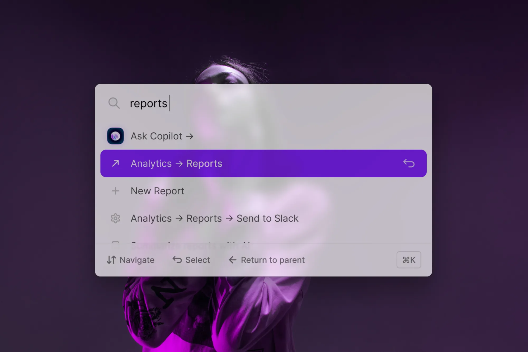
SaaS applications have been transformed by command palettes like Command AI—an omnipotent search bar that helps users carry-out actions, find relevant help content, and navigate a product.
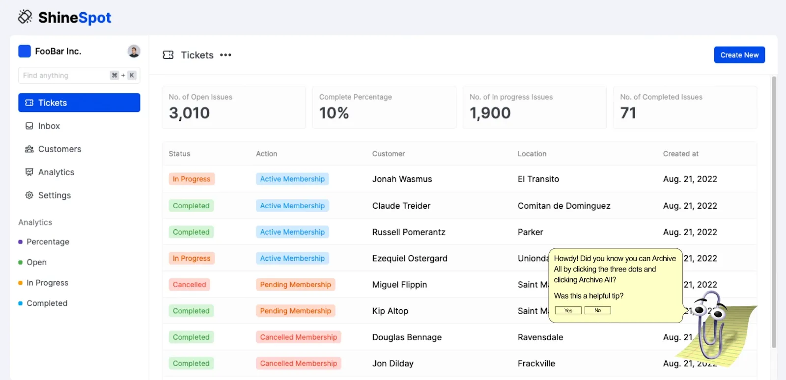
But unlike Clippy, interrupting you with a chirpy “Howdy!” a command palette fits in as part of a page’s everyday UI. Once opened, given the page’s context, it might intelligently suggest a recommended action, surface a buried feature or relevant help content, and the user is free to search for whatever they wish—no silencing needed.
Learning from Clippy’s missteps
There's a lot that can be learned from Clippy's mistakes. Here are some of the things we've learned and applied when building Command AI.
Pull, don’t push
Using Command AI within a product enables the concept of user pull. Pull means shifting the burden to the user to tell you what they’re trying to do in an app, and then serving up results. Basically, it means giving users some way to search for what they’re trying to do. The key idea is to give the user the lowest-friction way possible to express their intent and enables the next tactic…
Learn from user actions
User pull enables a superpower: you can read a user’s mind and figure out user intent. When a user searches for something, they are telling you “I am interested in X” and Command AI stores search logs so that a product team can learn from what a user was telling them they wanted to do. Is a customer searching for a feature that is on the roadmap? Reach out and tell them it’s coming soon. Do you have customers searching for an integration you don’t support? You can use this data to inform your product roadmap and reprioritize building that integration.
Help users avoid distractions
Workers report at least 3 to 4 interruptions per day. Whether that’s due to a chatty coworker or maybe they just got sucked into another YouTube rabbit hole. Some of these factors are beyond our control, but Command AI helps keep users in flow by surfacing explainer videos and other helpful content in-app for access without distraction.
Guide rather than interrupt
Over a third of workers feel overwhelmed by persistent alerts, and up to 78% of users report deleting an app due to notification fatigue, prompting them to seek out how to delete the apps that disrupt their peace. Many apps overuse push strategies, but when timed correctly, they can be helpful.
Consider what happens when you want to upgrade an app’s plan, for example. You need to hold a lot of context in your head: why you’re upgrading, what will happen if you don’t upgrade, how to upgrade, and (if a B2B tool) who to inform about the upgrade. If the app sends an email instead of a nudge, you will likely have forgotten some of this context by the time you see it. Instead, it can be helpful to get a quick nudge or call-to-action that guides you down a path to upgrade at that exact moment.
The silver lining to Clippy’s irksome interruptions then, is that he walked so today’s in-app tools could run.
A command palette is perhaps the closest product to Clippy’s original value-prop, but importantly, with a passive philosophy. Clippy was designed around smart-but-actually-dumb interruptions; command palettes are instead visibly available but silent.
In short, if we were to ignore the final season, Command AI is the Daenerys of UX widgets, the rightful and progressive descendent of Clippy, the mad king.

Love it or hate it, Clippy might’ve not been the hero we wanted, but the one we needed.
